Template · Working reference · Noord
Brand guidelines template
A reusable brand-book structure with visual examples and source fields.
Download this method as MarkdownWhat it is for
A brand guide has to keep working after the designer leaves the room. Someone should be able to open it, choose the right file, and make a page without calling you to ask what the rules meant.
This template gives you a place to put those decisions. Acme is a fictional example, not a finished identity to borrow. Replace it with your own work and keep the examples that explain something a colleague will actually need to do.
- For
- Designers documenting an identity
- Use when
- A visual direction has been approved and other people need to use it.
- Bring
- Approved marks, palette, typefaces, voice and a list of real applications.
- Leave with
- A reusable identity reference with examples and ownership.
A worked example
Fictional example
For a fictional repair service, define a primary text color, an accessible link color, two type sizes and a sample booking confirmation before making promotional mockups.
Check the result
Ask a second designer to create one application without additional verbal guidance.
What this leaves open
The source uses fictional placeholders. Replace them and verify font and image licenses.
Tools, in order
Here is where each tool helps. Use an equivalent you already work with if it fits the task and your project’s access requirements.
Before documenting
NotionA versioned project folder
Gather approved identity decisions and the files that prove them. Leave missing values as questions rather than filling the template with plausible choices.
Carry forward An approved source inventory.
While assembling
After the draft
Browser and accessibility checksA versioned project folder
Ask another practitioner to make one application without a verbal briefing. Record what they could not find or interpret, and fix the reference.
Carry forward A usable guideline with ownership, examples, and source files.
Review the work with partners
We make and revise the work with Claude, ChatGPT, or Grok, then put selected versions on our Studio project pages for partners to review. Check the preview before sharing it. You can do the same with a private prototype or shared document; use a workspace that can access the files you need.
Name the version, say what changed, and ask the question you need answered. Keep feedback with that version and discuss conflicting requests before making the next changes. Confirm approval separately, and keep confidential work in a restricted space.
A question for this review
Could someone make the next application from this reference without asking us what it means?
Delegate the routine work
Populate known source fields, format sections, and check repeated values against an approved inventory.
Identity choices, accessibility judgments, and permission to reuse assets are not template-filling tasks.
How to use it
- Start with a short account of the organization, its audience and the promise the identity must support.
- Document voice, logo usage, color roles, typography and layout. Explain exceptions as well as the normal case.
- Include accessible color pairs, font licensing information, minimum sizes and examples at realistic content lengths.
- Finish with file locations, ownership and an approval record. A guideline is useful only when someone else can apply it.
The complete master structure
Acme is the fictional placeholder brand. Use the visual examples alongside the source structure below.
Brand Guidelines Template · 2026
Every brand starts from this shape
The master template behind every Noord-built brand system. Each section below is a placeholder: the structure, the components, and the order are the deliverable; the client supplies the content.
01Overview
The brand
Two or three paragraphs that say what the company is, who it serves, and why it exists, written the way the founders would say it across a table, then edited until nothing performs.
The overview sets the register for everything that follows. If a sentence here wouldn't survive being read aloud in a client meeting, it doesn't survive here.
02Strategy
Strategy
Mission
The change the company exists to make, in one line.
Positioning
One sentence that places the brand: who it's for, what it does, and the difference that makes it the obvious choice.
Values
- First value. One sentence on what this value means in practice: a behavior, never a platitude.
- Second value. Values earn their place by excluding something; say what this one rules out.
- Third value. Three is usually enough. A value nobody would ever reverse isn't a value.
Who we work with
The two or three audiences that matter, named specifically enough that the photography and tone sections can point back at them.
03Voice & tone
Voice
How the brand sounds: one register, held everywhere from the homepage to a support reply.
Principles
- Plain. Short sentences, concrete words, no jargon the reader has to translate.
- Level. Good and bad news in the same calm voice; confidence never needs volume.
- Specific. Numbers, names, and examples over adjectives.
What we say — and don't
An example sentence in the brand's actual voice.
A second one, showing how it handles a claim.
A third, showing how it handles bad news.
The vocabulary this brand never uses
Superlatives and exclamation marks
Anything the reader has heard a hundred times
04Logo
Logo
The mark and the wordmark, where each is used, and the files to use them from. The Acme placeholder mark stands in here. The client's mark takes its place, with its own construction note.
Clear space & sizing
Define clear space in units of the mark itself (a wave, a letter height) so it scales with use.
Misuse
- Do not recolor the mark outside the palette
- Do not stretch, rotate, or add effects
- Do not set the wordmark in another face
- Do not redraw it: use the provided files
Credit the mark's designer here, with a link.
05Color
Color
The template ships in process color — cyan, magenta, yellow, key — so every swatch is visibly a placeholder. The client's palette replaces it one-for-one: a working accent, grounds, ink, and a note on what each color is for.
Accent use
One color behaves like ink and does the interactive work; the others earn their appearances. Name the rule for the client's palette here.
06Typography
Typography
One family, few weights, a fixed scale. The samples below describe themselves. Replace them with lines in the client's voice, set in the client's licensed face.
The display size carries one idea
A display line, and nothing beside it
Titles hold sections together
Subheads do quiet structural work
Body text is the brand most people actually meet: a comfortable measure, a steady rhythm, and no tricks. Everything else exists to bring readers here.
Labels · metadata · captions · 12px
Rules of thumb
- State the caps rule — most brands here never set all caps
- Fix the scale; add width to the page, never to the paragraph
- Name the fallback stack for email and documents
Credit the typeface and foundry here, with a link to the license.
07Layout & grid
Layout & grid
The structural rules every surface shares: the module, the gutters, the reading measure, and how boxes sit on the grid. Keep this section even for print-only brands. The discipline is the point.
08Photography
Photography
The art direction in two or three sentences: what gets photographed, in what light, from what distance, written so a photographer the brand has never met could shoot a usable set. The plates below hold the place of the client's photography.
- State the light rule (natural, overcast, hard flash; pick one)
- State the people rule (working, never posing, or none at all)
- State what is banned (stock, filters, tilted horizons)
09Environment
Out in the world
The same eight contexts every system is tested against. The green panels are exactly that: chroma surfaces where the client's artwork composites in, so one photo set serves every brand.
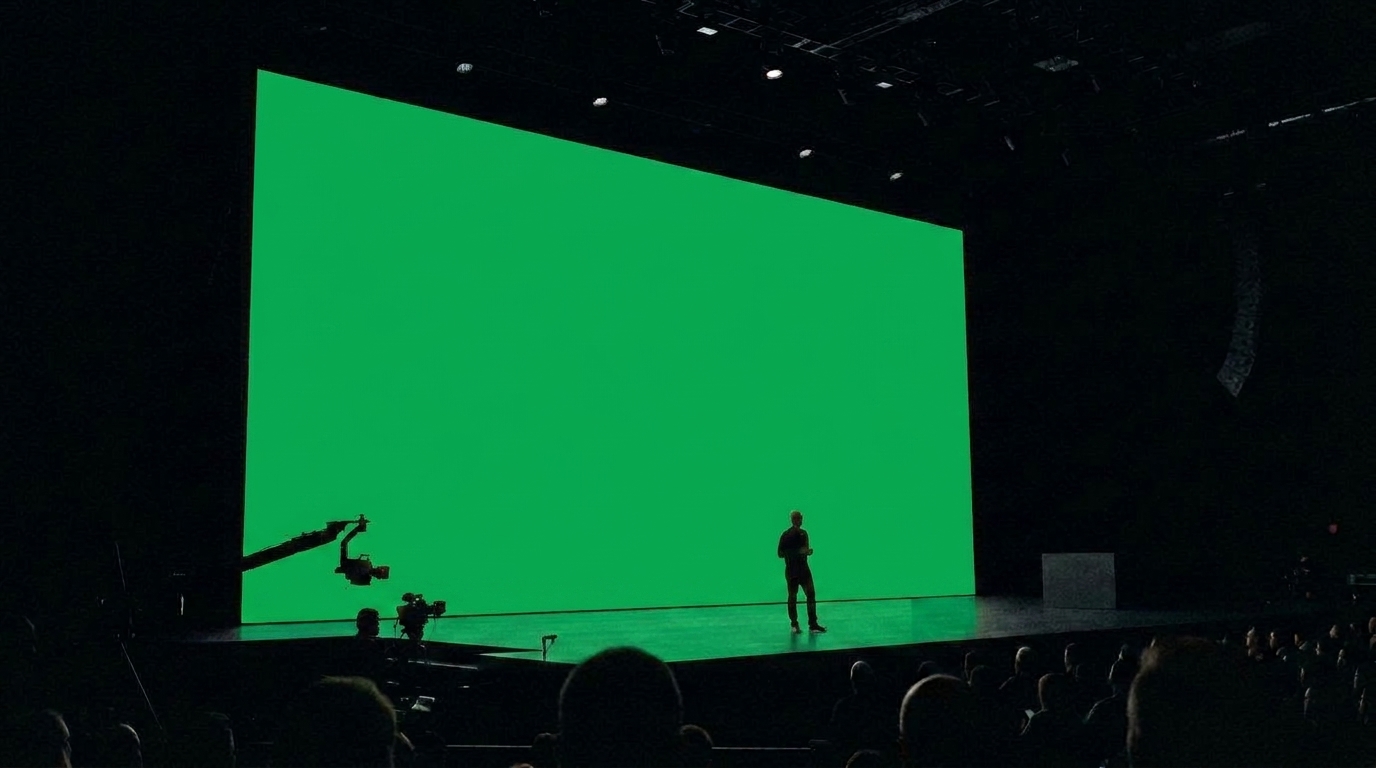 Large screens
A keynote or lobby display. The green area takes the client's slide: logo and one line, left aligned.
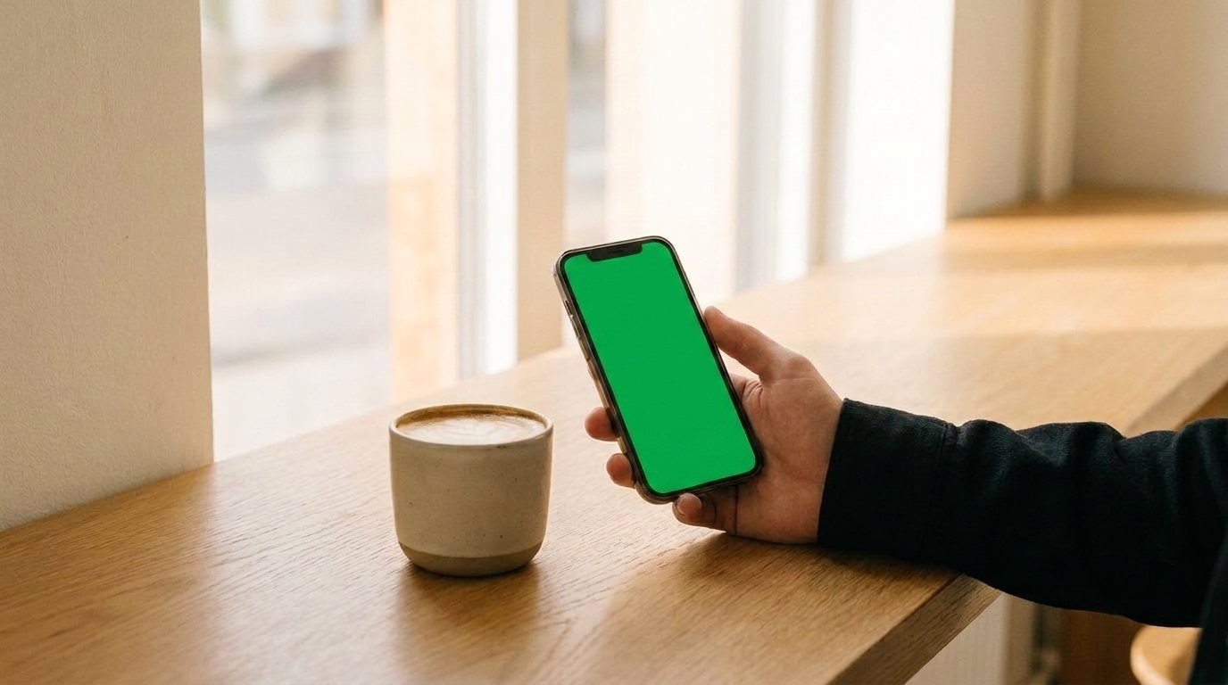 Small screens
The brand at phone scale in a real hand. The green display takes a homepage or app screen.
 Outside
Glass-door signage. The green panel takes the mark, centered, in vinyl scale.
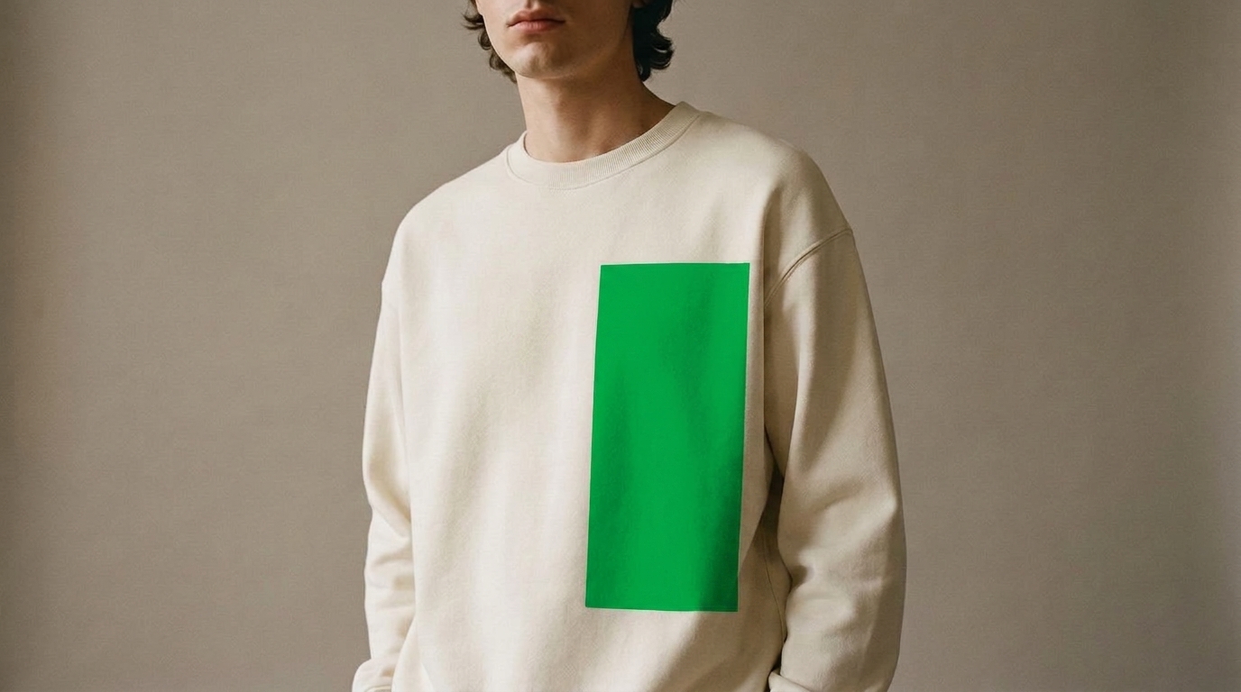 Merch
MerchApparel and objects. The green print area takes the mark or a single line, following the fabric.
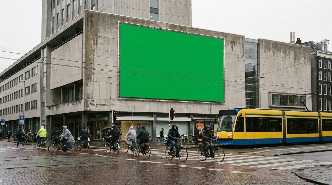 Billboards
Out-of-home at road scale. The green face takes one headline and the mark. Nothing else survives at 80 km/h.
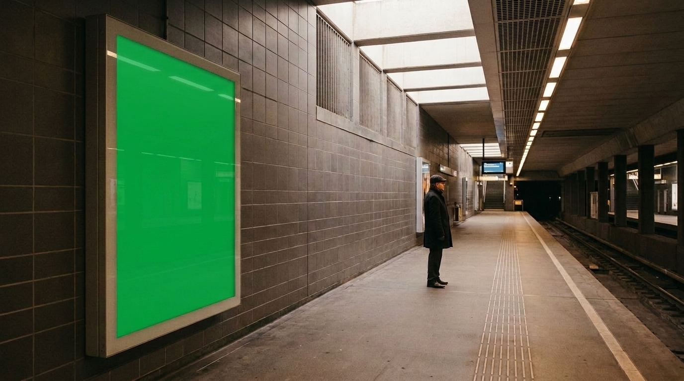 Subway ads
Platform posters read at close range. The green face takes a longer line set at reading scale.
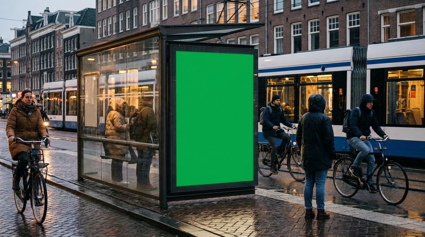 Bus stop ads
The abri format, behind glass. The green face takes the same system as the billboard, one size down.
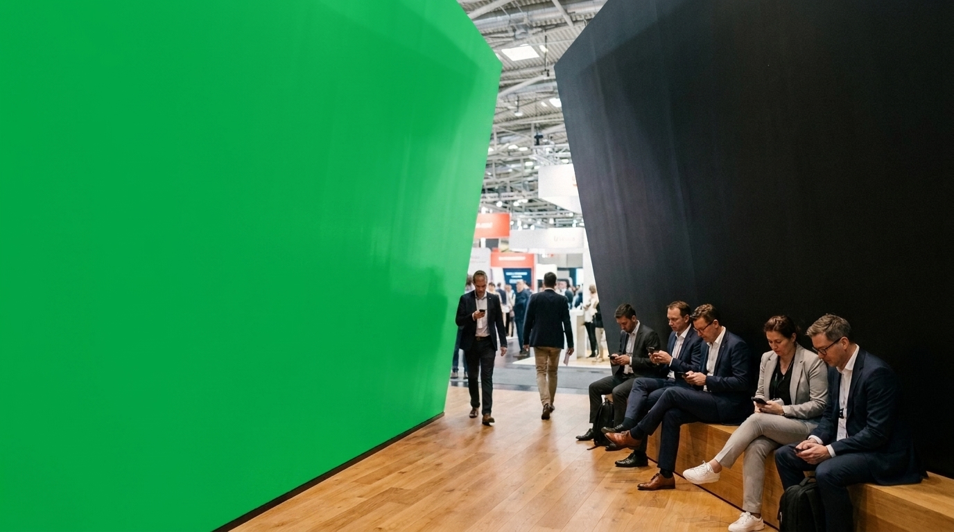 Conference presence
An immersive booth. The green wall takes large typography that follows the architecture.
10Motion
Motion
How the brand moves: the duration, the easing, and the one-sentence character note — calm and physical, quick and precise, whatever the brand is. Nothing here should need a video to explain. The demos below are the fixed structure; the words and tempo become the client's.
11Icons
Icons
The brand's icon set, drawn fresh for every client on the same 16px grid. The geometric placeholders below hold the structure: the client's set replaces them in its own stroke weight, terminals, and color.
12Components
Components
The interface kit in the brand's clothes: buttons, fields, tables, and one worked card example so engineers inherit decisions instead of making them.
Buttons & links
Badges
Card
A worked example
One realistic card, filled with the client's actual content, never lorem ipsum.
Form
Icons
13Two names
Expressions
How the brand flexes across named surfaces or sub-brands, if it has them: same identity, different jobs. Delete this section for single-surface brands.
The primary expression: the company as the market meets it.
- The website and product
- Sales and tenders
- The fleet and signage
A second expression sharing the same visual system under its own name.
- Research publications
- Events and talks
- Early-access releases
14Do & don't
In short
- Keep every rule falsifiable — someone must be able to break it
- Show one worked example per rule
- Write for the person who joins after you leave
- Date the system and note what changed
- No rule without a reason attached
- No lorem ipsum anywhere in the final system
- No section kept empty for ceremony; delete it
- No PDF as the only home; the system lives where the work does
Brand Guidelines Template · v1.0 · The master every client system starts from
Source structure
cover
{
  "label": "Brand Guidelines Template · 2026",
  "title": "Every brand starts\nfrom this shape",
  "subtitle": "The master template behind every Noord-built brand system. Each section below is a placeholder: the structure, the components, and the order are the deliverable; the client supplies the content."
}
overview
{
  "heading": "The brand",
  "paragraphs": [
    "Two or three paragraphs that say what the company is, who it serves, and why it exists, written the way the founders would say it across a table, then edited until nothing performs.",
    "The overview sets the register for everything that follows. If a sentence here wouldn't survive being read aloud in a client meeting, it doesn't survive here."
  ]
}
strategy
{
  "heading": "Strategy",
  "positioning": "One sentence that places the brand: who it's for, what it does, and the difference that makes it the obvious choice.",
  "mission": "The change the company exists to make, in one line.",
  "values": [
    {
      "word": "First value",
      "def": "One sentence on what this value means in practice: a behavior, never a platitude."
    },
    {
      "word": "Second value",
      "def": "Values earn their place by excluding something; say what this one rules out."
    },
    {
      "word": "Third value",
      "def": "Three is usually enough. A value nobody would ever reverse isn't a value."
    }
  ],
  "audience": "The two or three audiences that matter, named specifically enough that the photography and tone sections can point back at them."
}
voice
{
  "heading": "Voice",
  "intro": "How the brand sounds: one register, held everywhere from the homepage to a support reply.",
  "principles": [
    {
      "word": "Plain",
      "def": "Short sentences, concrete words, no jargon the reader has to translate."
    },
    {
      "word": "Level",
      "def": "Good and bad news in the same calm voice; confidence never needs volume."
    },
    {
      "word": "Specific",
      "def": "Numbers, names, and examples over adjectives."
    }
  ],
  "say": [
    "An example sentence in the brand's actual voice.",
    "A second one, showing how it handles a claim.",
    "A third, showing how it handles bad news."
  ],
  "avoid": [
    "The vocabulary this brand never uses",
    "Superlatives and exclamation marks",
    "Anything the reader has heard a hundred times"
  ]
}
logo
{
  "heading": "Logo",
  "intro": "The mark and the wordmark, where each is used, and the files to use them from. The Acme placeholder mark stands in here. The client's mark takes its place, with its own construction note.",
  "mark": {
    "viewBox": "0 0 48 48",
    "color": "#00AEEF",
    "markup": "<rect x=\"6\" y=\"6\" width=\"36\" height=\"36\" rx=\"4\" stroke=\"currentColor\" stroke-width=\"3\" fill=\"none\"/><path d=\"M15 33 24 15l9 18\" stroke=\"currentColor\" stroke-width=\"3\" stroke-linecap=\"round\" stroke-linejoin=\"round\" fill=\"none\"/>"
  },
  "clearspace": "Define clear space in units of the mark itself (a wave, a letter height) so it scales with use.",
  "misuse": [
    "Do not recolor the mark outside the palette",
    "Do not stretch, rotate, or add effects",
    "Do not set the wordmark in another face",
    "Do not redraw it: use the provided files"
  ],
  "credit": "Credit the mark's designer here, with a link."
}
color
{
  "heading": "Color",
  "intro": "The template ships in process color — cyan, magenta, yellow, key — so every swatch is visibly a placeholder. The client's palette replaces it one-for-one: a working accent, grounds, ink, and a note on what each color is for.",
  "palettes": [
    {
      "label": "Process",
      "swatches": [
        {
          "name": "Cyan",
          "hex": "#00AEEF",
          "role": "Primary accent — links, data, active states"
        },
        {
          "name": "Magenta",
          "hex": "#EC008C",
          "role": "Secondary accent — sparingly"
        },
        {
          "name": "Yellow",
          "hex": "#FFF200",
          "role": "Highlight — rarer still",
          "light": true
        },
        {
          "name": "Key",
          "hex": "#1A1A1A",
          "role": "Ink — text and marks"
        }
      ]
    },
    {
      "label": "Ground",
      "swatches": [
        {
          "name": "Paper",
          "hex": "#FFFFFF",
          "role": "Light ground",
          "light": true
        },
        {
          "name": "Tint",
          "hex": "#F2F2F2",
          "role": "Raised surfaces",
          "light": true
        },
        {
          "name": "Key 900",
          "hex": "#111111",
          "role": "Dark ground"
        }
      ]
    }
  ],
  "ramps": [
    {
      "label": "Cyan",
      "steps": [
        {
          "name": "100",
          "hex": "#00AEEF"
        },
        {
          "name": "75",
          "hex": "#40C2F3",
          "light": true
        },
        {
          "name": "50",
          "hex": "#80D7F7",
          "light": true
        },
        {
          "name": "25",
          "hex": "#BFEBFB",
          "light": true
        },
        {
          "name": "10",
          "hex": "#E5F7FD",
          "light": true
        }
      ]
    },
    {
      "label": "Magenta",
      "steps": [
        {
          "name": "100",
          "hex": "#EC008C"
        },
        {
          "name": "75",
          "hex": "#F140A9",
          "light": true
        },
        {
          "name": "50",
          "hex": "#F580C6",
          "light": true
        },
        {
          "name": "25",
          "hex": "#FABFE2",
          "light": true
        },
        {
          "name": "10",
          "hex": "#FDE5F4",
          "light": true
        }
      ]
    },
    {
      "label": "Yellow",
      "steps": [
        {
          "name": "100",
          "hex": "#FFF200",
          "light": true
        },
        {
          "name": "75",
          "hex": "#FFF540",
          "light": true
        },
        {
          "name": "50",
          "hex": "#FFF980",
          "light": true
        },
        {
          "name": "25",
          "hex": "#FFFCBF",
          "light": true
        },
        {
          "name": "10",
          "hex": "#FFFEE5",
          "light": true
        }
      ]
    },
    {
      "label": "Key",
      "steps": [
        {
          "name": "100",
          "hex": "#1A1A1A"
        },
        {
          "name": "75",
          "hex": "#535353"
        },
        {
          "name": "50",
          "hex": "#8C8C8C"
        },
        {
          "name": "25",
          "hex": "#C6C6C6",
          "light": true
        },
        {
          "name": "10",
          "hex": "#E8E8E8",
          "light": true
        }
      ]
    }
  ],
  "accentNote": "One color behaves like ink and does the interactive work; the others earn their appearances. Name the rule for the client's palette here."
}
typography
{
  "heading": "Typography",
  "intro": "One family, few weights, a fixed scale. The samples below describe themselves. Replace them with lines in the client's voice, set in the client's licensed face.",
  "fontStack": "'Helvetica Neue', Helvetica, Arial, sans-serif",
  "foundry": "Credit the typeface and foundry here, with a link to the license.",
  "scale": [
    {
      "label": "Display XL / 46",
      "spec": "46px · 600 · -0.03em",
      "sample": "The display size carries one idea",
      "px": 46,
      "weight": 600,
      "tracking": "-0.03em"
    },
    {
      "label": "Display / 38",
      "spec": "38px · 600 · -0.03em",
      "sample": "A display line, and nothing beside it",
      "px": 38,
      "weight": 600,
      "tracking": "-0.03em"
    },
    {
      "label": "Title / 24",
      "spec": "24px · 600 · -0.02em",
      "sample": "Titles hold sections together",
      "px": 24,
      "weight": 600,
      "tracking": "-0.02em"
    },
    {
      "label": "Subhead / 17",
      "spec": "17px · 600 · -0.01em",
      "sample": "Subheads do quiet structural work",
      "px": 17,
      "weight": 600,
      "tracking": "-0.01em"
    },
    {
      "label": "Body / 15",
      "spec": "15px · 500 · -0.01em",
      "sample": "Body text is the brand most people actually meet: a comfortable measure, a steady rhythm, and no tricks. Everything else exists to bring readers here.",
      "px": 15,
      "weight": 500,
      "tracking": "-0.01em",
      "lineHeight": 1.6
    },
    {
      "label": "Label / 12",
      "spec": "12px · 500 · 0em",
      "sample": "Labels · metadata · captions · 12px",
      "px": 12,
      "weight": 500,
      "tracking": "0em"
    }
  ],
  "rules": [
    "State the caps rule — most brands here never set all caps",
    "Fix the scale; add width to the page, never to the paragraph",
    "Name the fallback stack for email and documents"
  ]
}
grid
{
  "heading": "Layout & grid",
  "body": "The structural rules every surface shares: the module, the gutters, the reading measure, and how boxes sit on the grid. Keep this section even for print-only brands. The discipline is the point.",
  "columnLabel": "Reading column · ~592px"
}
imagery
{
  "heading": "Photography",
  "body": "The art direction in two or three sentences: what gets photographed, in what light, from what distance, written so a photographer the brand has never met could shoot a usable set. The plates below hold the place of the client's photography.",
  "rules": [
    "State the light rule (natural, overcast, hard flash; pick one)",
    "State the people rule (working, never posing, or none at all)",
    "State what is banned (stock, filters, tilted horizons)"
  ],
  "plates": [
    "Establishing — the world the brand operates in",
    "Detail — the work up close",
    "People — who does it, mid-task",
    "Context — where it lands, in use"
  ]
}
environments
{
  "heading": "Out in the world",
  "intro": "The same eight contexts every system is tested against. The green panels are exactly that: chroma surfaces where the client's artwork composites in, so one photo set serves every brand.",
  "items": [
    {
      "kind": "large-screen",
      "label": "Large screens",
      "desc": "A keynote or lobby display. The green area takes the client's slide: logo and one line, left aligned.",
      "src": "/brand/template/gs-large.jpg"
    },
    {
      "kind": "small-screen",
      "label": "Small screens",
      "desc": "The brand at phone scale in a real hand. The green display takes a homepage or app screen.",
      "src": "/brand/template/gs-small.jpg"
    },
    {
      "kind": "outdoor",
      "label": "Outside",
      "desc": "Glass-door signage. The green panel takes the mark, centered, in vinyl scale.",
      "src": "/brand/template/gs-outdoor.jpg"
    },
    {
      "kind": "merch",
      "label": "Merch",
      "desc": "Apparel and objects. The green print area takes the mark or a single line, following the fabric.",
      "src": "/brand/template/gs-merch.jpg"
    },
    {
      "kind": "billboard",
      "label": "Billboards",
      "desc": "Out-of-home at road scale. The green face takes one headline and the mark. Nothing else survives at 80 km/h.",
      "src": "/brand/template/gs-billboard.jpg"
    },
    {
      "kind": "subway",
      "label": "Subway ads",
      "desc": "Platform posters read at close range. The green face takes a longer line set at reading scale.",
      "src": "/brand/template/gs-subway.jpg"
    },
    {
      "kind": "bus-stop",
      "label": "Bus stop ads",
      "desc": "The abri format, behind glass. The green face takes the same system as the billboard, one size down.",
      "src": "/brand/template/gs-busstop.jpg"
    },
    {
      "kind": "conference",
      "label": "Conference presence",
      "desc": "An immersive booth. The green wall takes large typography that follows the architecture.",
      "src": "/brand/template/gs-conference.jpg"
    }
  ]
}
motion
{
  "heading": "Motion",
  "body": "How the brand moves: the duration, the easing, and the one-sentence character note — calm and physical, quick and precise, whatever the brand is. Nothing here should need a video to explain. The demos below are the fixed structure; the words and tempo become the client's.",
  "chips": [
    "One easing",
    "One duration scale",
    "State what never happens"
  ],
  "demos": [
    {
      "kind": "word",
      "text": "A line in the brand's voice",
      "label": "Typography — name the move and its timing"
    },
    {
      "kind": "ui",
      "button": "Primary action",
      "label": "UI — state changes; layout holds still"
    },
    {
      "kind": "line",
      "text": "The campaign line goes here.",
      "label": "Campaign — how lines enter and leave"
    }
  ]
}
icons
{
  "heading": "Icons",
  "body": "The brand's icon set, drawn fresh for every client on the same 16px grid. The geometric placeholders below hold the structure: the client's set replaces them in its own stroke weight, terminals, and color.",
  "glyphs": [
    {
      "name": "square",
      "markup": "<rect x=\"2.75\" y=\"2.75\" width=\"10.5\" height=\"10.5\" stroke=\"currentColor\" stroke-width=\"1.5\" vector-effect=\"non-scaling-stroke\"/>"
    },
    {
      "name": "circle",
      "markup": "<circle cx=\"8\" cy=\"8\" r=\"5.25\" stroke=\"currentColor\" stroke-width=\"1.5\" vector-effect=\"non-scaling-stroke\"/>"
    },
    {
      "name": "triangle",
      "markup": "<path d=\"M8 2.75 13.5 13.25H2.5Z\" stroke=\"currentColor\" stroke-width=\"1.5\" stroke-linejoin=\"round\" vector-effect=\"non-scaling-stroke\"/>"
    },
    {
      "name": "cross",
      "markup": "<path d=\"M3.5 3.5l9 9M12.5 3.5l-9 9\" stroke=\"currentColor\" stroke-width=\"1.5\" stroke-linecap=\"round\" vector-effect=\"non-scaling-stroke\"/>"
    },
    {
      "name": "line",
      "markup": "<path d=\"M2.5 8h11\" stroke=\"currentColor\" stroke-width=\"1.5\" stroke-linecap=\"round\" vector-effect=\"non-scaling-stroke\"/>"
    },
    {
      "name": "point",
      "markup": "<circle cx=\"8\" cy=\"8\" r=\"2.5\" fill=\"currentColor\"/>"
    }
  ],
  "note": "State the construction rules here: the grid, the stroke weight and how it holds across sizes, the terminals, and when an icon may fill.",
  "color": "#00AEEF"
}
components
{
  "heading": "Components",
  "body": "The interface kit in the brand's clothes: buttons, fields, tables, and one worked card example so engineers inherit decisions instead of making them.",
  "card": {
    "label": "Card label",
    "title": "A worked example",
    "body": "One realistic card, filled with the client's actual content, never lorem ipsum."
  }
}
expressions
{
  "heading": "Expressions",
  "intro": "How the brand flexes across named surfaces or sub-brands, if it has them: same identity, different jobs. Delete this section for single-surface brands.",
  "items": [
    {
      "name": "Acme",
      "line": "The primary expression: the company as the market meets it.",
      "list": [
        "The website and product",
        "Sales and tenders",
        "The fleet and signage"
      ]
    },
    {
      "name": "Acme Labs",
      "line": "A second expression sharing the same visual system under its own name.",
      "list": [
        "Research publications",
        "Events and talks",
        "Early-access releases"
      ]
    }
  ]
}
rules
{
  "do": [
    "Keep every rule falsifiable — someone must be able to break it",
    "Show one worked example per rule",
    "Write for the person who joins after you leave",
    "Date the system and note what changed"
  ],
  "dont": [
    "No rule without a reason attached",
    "No lorem ipsum anywhere in the final system",
    "No section kept empty for ceremony; delete it",
    "No PDF as the only home; the system lives where the work does"
  ]
}
Leave the next person enough to work with
Write down what was decided and why, with links to the notes or examples behind it. Keep the open questions alongside the decisions. Someone joining the project should be able to tell which is which without asking you.
Project: [name]
Input sources: [references and permission]
Approved decisions: [choice, rationale, owner]
Assumptions: [what remains untested]
Open questions: [question, owner, due date]
Acceptance checks: [observable pass/fail criteria]
Next step: [person or workflow]
Approval: [name, date, version]
Before you move on
- Can someone who was not in the room understand the result?
- Are claims supported by evidence, with uncertainty labeled?
- Has the responsible person approved the decisions—not just received the document?
- Have you removed private information and checked rights to any assets?
If the summary says something was agreed and you cannot find that agreement in the notes, ask the person who decides before carrying it into the next task.